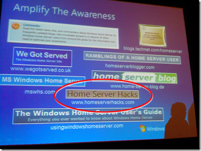
At the Microsoft MVP Summit held this last week in Seattle, the WHS product team hosted a 4 hour in depth open session to explain the inner workings of Windows Home Server and invited all of the MVPs to attend. At end end of one of the PowerPoint decks was a slide showing some of the community sites that have sprung up. To my surprise and delight, Home Server Hacks was mentioned. Whooo hooooo!
While I was glad to see my "logo" up on the big screen, I thought to myself "Wow, my logo really sucks!". So on the flight back to the east coast today, I got out my laptop, fired up Photoshop and attempted to reconcile the situation. This is what I came up with for website v1.1.
Here is a side-by-side comparison showing the website header before:

and after:

Expect to see it on coffee mugs and t-shirts in malls across America. Let me know what you think about the new logo. I'm not a trained graphics designer so please be kind.

3 comments:
I like the top one better but think the Title Font should be larger. It just looks to small for the space it occupies. My wife is a graphic designer specializing in logos. If you'd like some free advice, let me know.
Doug
I like the new one! The 'HSH' is cool. And the new white site-name is nice.
I really enjoy your site. Thanks for all the great posts.
Rock on!
Peter
Is Donavon West in the building? Tried to find you as I wanted to say hi. Ooh well, there's always next year.
Good to see your name in lights!
Post a Comment